Thursday, 9 June 2016

Exhibition Plan

1. Artists using similar techniques to me will usually present their ideas either via a blog or on a screen, via digital presentation.
2. As my work is themed around space, I would rent out an observatory and have my work placed around the building as I give a tour.
3. Ideally I'd like my audience to be general fans of science fiction, with a few industry professionals mixed in.
4. See below.
5. My mother and grandmother.
6. Reddit could be a useful board with which to spread my work.

Friday, 27 May 2016

Evaluation

The theme of my project was initially intended to be a bullet hell style game, but over the course of the project evolved into more of a general theme of space and science fiction. I have developed my ideas from brief and extremely vague and rough initial sketches to a much more refined and detailed painting of the protagonist of my intended game's ship, which was largely created by blending together many previous detailed designs and sprites. I've found a sizeable chunk of reference material throughout the project, usually in the form of artist research, which I feel has made a substantial contribution to my project overall. Spaceships are large and difficult to draw without any sort of guidance, so having some images to give a feel for how to begin was certainly useful. They also helped with understanding of tone, colour, lighting and so on. I feel that my progress would have been not only hampered, but outright halted had I not had any reference material with which to first shape, then consolidate my work.
 When looking for artists with whom to take inspiration from, I chose to look towards concept artists for more prominent pillars of the sci-fi genre, such as Star Wars, Star Trek and Battlestar Galactica. I also chose a more obscure reference, namely Hans Palm, who is much more low-key, and develops models for games, such as guns or spaceships, rather than working on films or a television series. Their techniques and tools varied greatly, some preferring paint, others pencil, others preferring software such as PhotoShop. Although I used no paint throughout the project, pencil and PhotoShop were two methods I made frequent use of for the entire duration of the assignment.
 As previously mentioned, my project has undergone a gradual but steady evolution in goal as time has progressed. Initially it was intended to be much more chaotic and take on a much more specific theme, namely that of a traditional Japanese bullet hell style game set with a spacial theme. Eventually the bullet hell aspect faded before nearly dropping out of the project entirely, and more of a general space and science fiction theme gradually began to take over the main focus of the project.
 There were no specific or hidden meanings I was trying to convey with my design. The overall feeling of the piece should hopefully be one of curiosity, as the design of the ship is far from conventional, almost resembling more of a space motorbike than a spaceship. The ship takes on a rather bizarre and bright colour scheme, immediately drawing attention to it and making it stand out from the much darker and more bland background, and overall I'm satisfied with the result.
 Regarding my plan, I didn't stick to it all that well, and I do regret this. I feel the project would have been much more of a success if I'd time managed better, and for any future plans I'll attempt to stick to them a lot more firmly rather than getting sidetracked and spending extra time on relatively unimportant areas.

Bibliography

https://upload.wikimedia.org/wikipedia/commons/6/63/African_elephant_warning_raised_trunk.jpg (n.d.). (Accessed 16th March 2016)
https://www.artstation.com/artist/millenia (2015). (Accessed 18th March 2016)
https://www.artstation.com/artwork/P6aQy (2015). (Accessed 18th March 2016)

Tuesday, 10 May 2016

Final Piece

An Alternate Colour Scheme for my Final Piece

My Final Piece
Demonstrating the use of the Rule of Thirds

Demonstrating the use of the Golden Ratio
A Colour Palette
This is the completed version of my final piece. Once again, I struggled to decide on an ideal lighting for the scene, and even now I still consider both to be near equal. However, in the end I leaned towards the blue tinted skies, finding the black skies gave a bit too much of a contrast with the stars, and feeling the white glow at the top right felt a bit too intense and distracting.
I have added a planet to the bottom left of the screen. This was initially going to be a similar form as what I interpreted as the primary form in the piece I used for my artist research on Wassily Kandinsky, although after beginning to colour it I realised there was no real way for me to link the two. Nonetheless, I feel the planet adds to the scene nicely, as well as providing a vague sense of scale for the ship, and giving me a means of adding a glow effect.
Some lighting on the ship has been changed. Differences are subtle, but I tried to make the sides of the ship darker to indicate the sun was in front of the ship, outside of the scene, and that no light is being cast onto the sides.
I also smudged some of the stars to make them seem as though they were twinkling. I felt the sky was too plain with all the near identical stars, only differing in sizes, so I made some of them look more unique and eye-grabbing so as to prevent repetition and give the piece a sense of energy.
As you can see by the third and fourth images, I tried to abide by the Rule of Thirds and Golden Ratio. I feel that, when combined with the bright, alien colours that stand out against the dimly lit landscape, these techniques proved extremely effective at drawing attention immediately to the ship.
Overall, I am satisfied with the outcome of my project, and feel it was a huge success. Sadly I was unable to pursue my initial goal of making a bullet hell themed project, but I feel just as satisfied having completed the task I settled for.

Final Piece Ideas


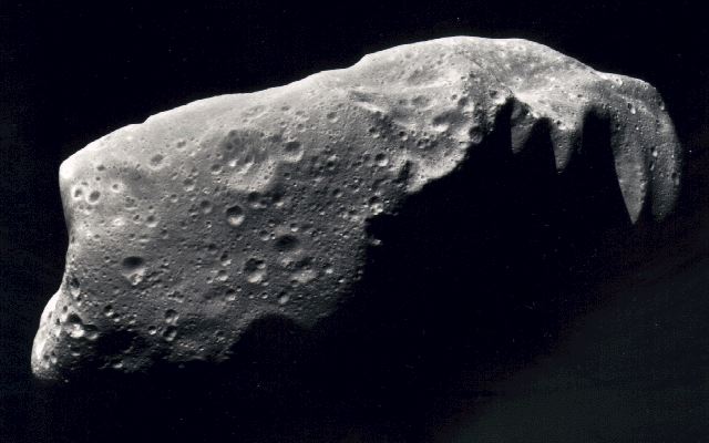
At this stage the ship has been refined and finalised, and the majority of the detail has been added to the background (i.e. the stars). The piece is almost done, but I struggled to decide between the lighter or darker background, and a few, more subtle details are missing. At this point in the project, I'm also unsure of how to fill the large void in the bottom left. More stars would feel boring and plain. I eventually decide to use a planet, partially because of my research into Wassily Kandinsky (Although that was an initial source of inspiration, he has very little to do with the end result for the planet), and one of the images I used as artist research into Ralph McQuarrie:

Further Development


In the end I decided that using one of the previous pieces as a part of the PhotoShop experiment as a front for my ship and drawing around it to work that into a 3D piece (As seen in the first image) would be a much better idea. The above image is a rough sketch of my final piece. Below is the picture of the ship itself, created by skewing one of the other designs and cloning it to make the two side panels, and using another design (Again, skewed to give the impression of the ship being at an angle) as the front.
It was irritating to try and angle the three panels in such a way as they resembled a ship (Even now it seems like more of a space motorbike, or space rickshaw, although overall I'm a lot happier with this design), which was once again a matter of trial and error. It took roughly fifteen minutes to get an arrangement I was satisfied with.

Software Experiments


A further development in my project, this involves me blending the abstract shapes from my development ideas together in an attempt to get something that better resembles a spaceship. This was an experiment with PhotoShop to try and discover a style I liked, and although I disliked the results initially, I quickly figured out a way in which I could use them, so I consider it an overall success.
I had some difficulty trying to get all of the individual shapes to slot together, particularly in ways that looked different. On more than one occasion I found myself saving an individual design, only to realise it was the same as a design I'd saved previously, only tilted 30 or so degrees. This was more a process of trial and error, as well as using one's imagination to try and come up with something both visually interesting and something that could be considered a ship.

Friday, 8 April 2016

Development Ideas

The topmost image is a template I used as a basis for the top row of sketches, which are potential shapes for my final piece to take. This design proved to be rather time-consuming and problematic to follow, however, so in the end I decided not to follow it and opted to move on. The bottom two rows are me attempting to make use of abstract art to get a better general feel for a potential final design for my ship. In the end, all are used, although not individually.
It's fairly clear that this is the point where I attempt to make use of my research into Wassily Kandinsky and his abstract art. The heavy use of primary colours and simple but wild shapes are a result of me trying to create a similar piece to his own.

My method for this involved colouring a large area in PhotoShop black, then tracing around it with the polygonal lasso tool in the desired shape and deleting the excess. Below is an example shape I created via the same method, as well as the shape I extracted it from.
After extracting the shape itself, I toyed with two different methods of adding colour. Simply colouring them by hand was fairly effective and easy, but using the polygonal lasso tool again in order to premake shapes, then colouring in the shape outlined was also fairly helpful, and allowed me to be much more precise. Overall, I think I preferred the latter method, at least in this instance.

Friday, 1 April 2016

Artist Research: Wassily Kandinsky

This is an image painted by Wassily Kandinsky, a Russian painter well known for his contributions to abstract art between the late nineteenth and early twentieth century. The dominant form in this piece seems to be the large, red and white coloured circle towards the top right. The black form behind it seems to resemble a spaceship in ways, relating to my piece. He also seems to make very sparing use of secondary and tertiary colours, and while they are by no means absent, primary colours overall dominate the piece. I am leaning towards using abstract art to create my final piece, so this is relevant to my project.

Friday, 25 March 2016

Observational Drawing


Above is an observational drawing I made of an image of a spaceship, and the source image I used with which to draw it. Spaceships are relevant to my final piece, so this is why I chose this to draw.
There weren't any real complications, and drawing it was relatively simple, although the proportions were difficult to stick to accurately.
I tried to adhere to the Rule of Thirds in this image. I feel I could have done so better, as due to a mistake with proportions, the drawing ended up looking closer to the centre than I'd liked. I will try to avoid this next time.
Since I plan to use a design for a spaceship as my final piece, I will continue to draw different designs of ship throughout the project to attempt to develop my drawing skills in this field.

Tuesday, 22 March 2016

Initial Sketches

These are some initial sketches I've made of items I could potentially use in my final piece, and fit the overall theme of my project. In this image there is an asteroid (The jagged, dotted drawing), a planet (Shaded and cratered), a satellite and a distant star. These are all rather generic, common objects in space, and thus could all prove rather useful in the making of my final piece.

Sunday, 20 March 2016

Rule of Thirds

This demonstrates how artists I've used for research throughout the project, such as Ralph McQuarrie, have used the Rule of Thirds to aid with composition of their work. The Rule of Thirds refers to a guideline rather than a rule, that states that an image should ideally be divided into nine equal parts by two equally spaced horizontal lines, and two similar vertical lines. Key features of the image should then be placed upon the points at which these lines intersect. It can also be used to give a general feel for proportions for things like land and sea/sky (Two parts land to one part sea/sky), or warm colours to cold colours, but its most common application is for positioning key components of the image. This is better for drawing focus and creates more of an interest than simply placing things at the centre of the image.

Colour Palettes

Below are some colour palettes sampled from the images I used for my artist research, as well as the images themselves.


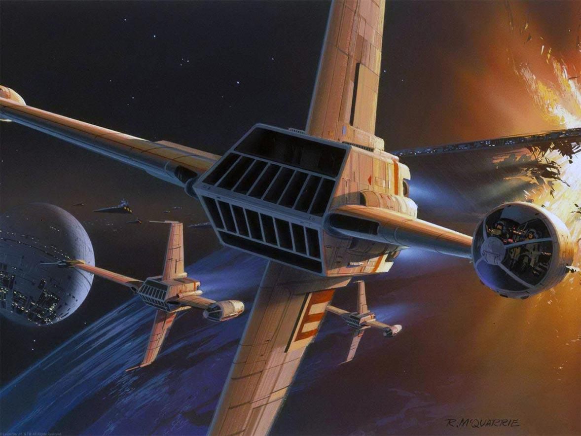
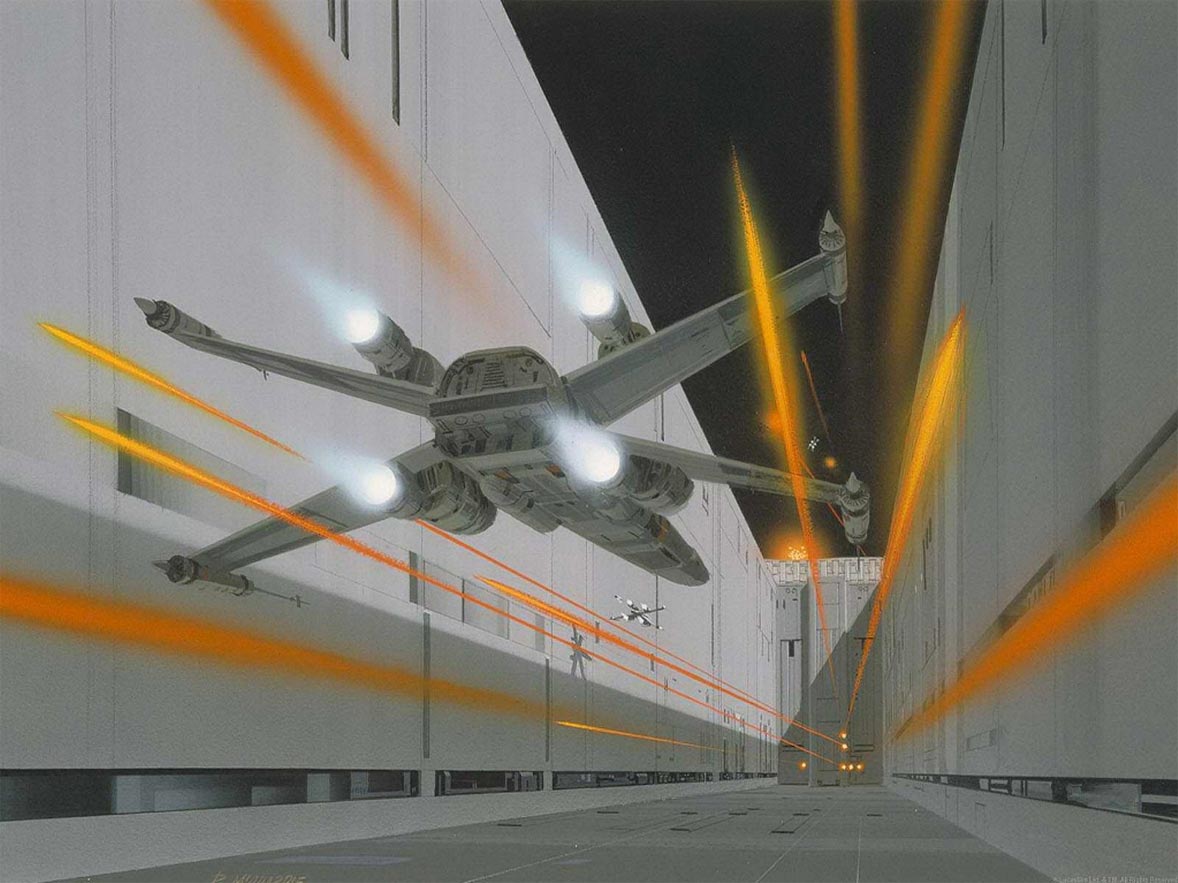
Above is a colour palette sampled from one of the images I used for my artist research, as well as the image itself. I observed that things such as much of the background and the ships are often made to look rather drab, almost monochromatic, with subtle touches of colouring in order to indicate who they fight for. The way they avoid the ships from being dull and failing to grab attention is by making them darker and bolder, and presenting them in the foreground to make sure they stand out and get noticed straight away. Thrusters will use colours associated with fire or energy, in this instance blue. Lasers and such consist of several harmonious colours, such as red, orange and yellow, with yellow being the concentrated, centre of the beam, and orange and red making the mass of it. They are usually brighter towards the centre.


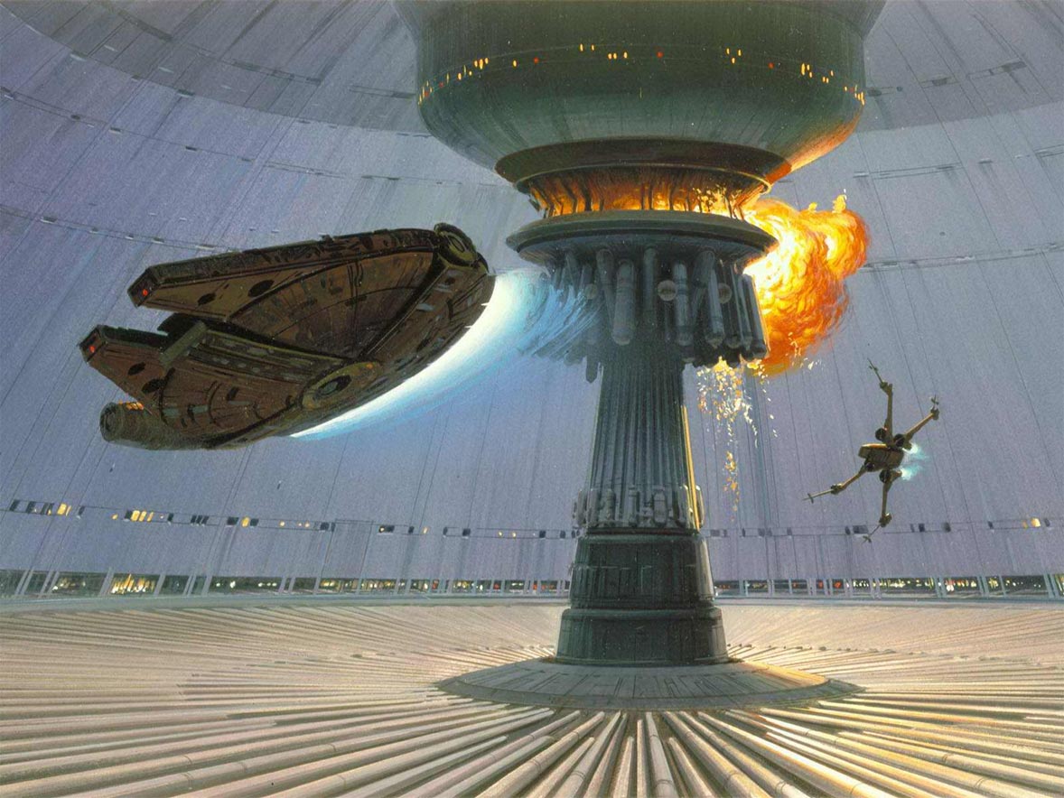
Consistent with the previous image, this picture uses a dull, greyish colour scheme for the majority of the background, albeit this time with a more blueish tinge. The ship is also placed in the foreground and darkened so as to make it stand out. The explosion in the pillar at the centre of the image uses harmonious colours, similar to the lasers in the first image; yellow at the centre where it's most intense, then orange and red at the edges of the plume. The thrusters in this image are, once again, blue. The pillar is cast in shadow to make it look darker than the rest of the scenery, and is once again placed into the foreground to make sure it's seen as important.


Very different to the previous two images, this image uses a much darker, blueish tone for the background. Rather than using shadow to highlight key aspects of the image, this picture instead opts to cast the general image in shadow, giving it a much more cold and lifeless, static feel, then chooses to cast light on the parts of the image he wants to be seen. In this image, the ship in the background is illuminated. Adding to the barren and lifeless feeling of the image, nothing appears to be happening in it; whereas in the previous two images there was clearly a lot of action taking place, the first featuring a laser battle and the latter having a large and prominent explosion, as well as what appears to be one spaceship chasing another, the ship is inactive and docked in this picture. Nothing visible is moving, or even alive, giving more of an alien, unsettling feel.

Friday, 18 March 2016

Artist Research

Ralph McQuarrie

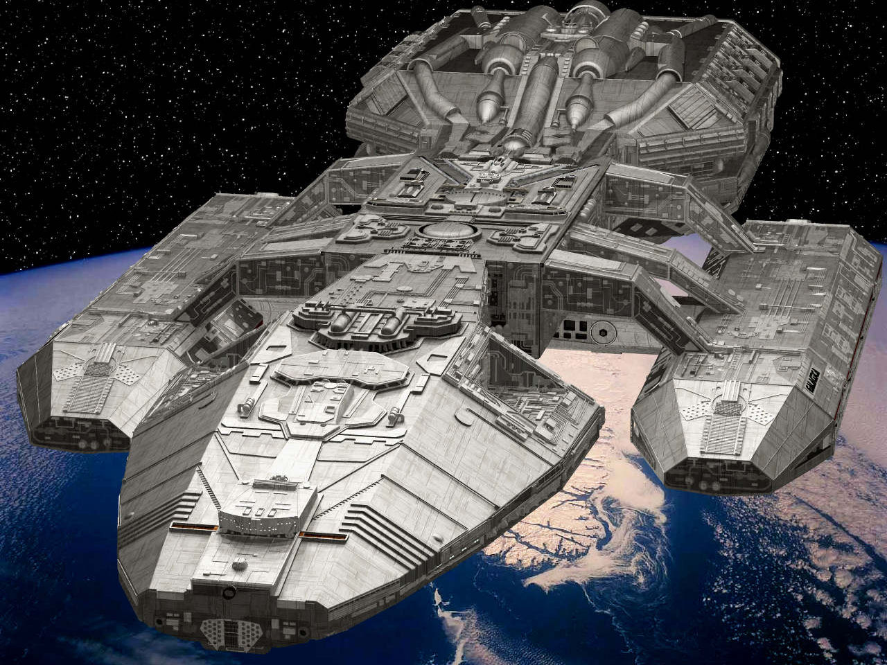
 Some of Ralph McQuarrie's notable works as a concept artist consist of the first three instalments (IV, V and VI) of the Star Wars movies, Battlestar Galactica, Cocoon and Indiana Jones: Raiders of the Lost Ark. Paint was his primary resource for concept art. Colour, light and line are extremely important elements to his pieces. He uses light to draw attention to the action in specific parts of the piece, as well as giving an indication of speed in many instances. For use of colour, he typically picks rather dimmed, monochromatic colours, then deviates from this colour scheme with one or two (If two, usually complimentary) brighter colours (Such as the red and orange used for the lasers in the middle right image) to catch the eye and make the image more exciting. As for line, he seems to favour a two point perspective.
 All of these pieces of art depict some sort of spaceship, which is the primary focus of my project (Both as enemies and the protagonist). They all draw attention to the ship in each respective image. A variety of different methods are used to achieve this, such as the rule of thirds, contrast and colour. I like the use of lighting in these pieces as a means of demonstrating speed in each image whilst still highlighting key portions of each piece.

Hans Palm

 This is a picture of the "Pioneer" ship from the game "Fractured Space", a cooperative, tactical shooter set in deep space. The ship itself was designed, modelled and textured by Hans Palm. His work consists of many different designs for spaceships and guns. He has twelve years of experience working with 3ds Max and Photoshop, the programs he used to make this specific piece.
 Colour seems to be the primary focus of his piece. Blue is used to give more of a cold, energetic sort of feel to parts of the ship that wouldn't be populated (Such as the thrusters), whereas the more hospitable areas of the ship (Such as the deck, visible at the top) are more of a warm, inviting yellow.
 I like the patchy, rough feel of the ships, as well as the use of colours to give clear visual indicators of different types of areas on the ship without needing an inside view.

James Clyne

 This is a piece of concept art, depicting the Narada from Star Trek: Into Darkness. It was designed by James Clyne, who started their career in the games industry, working for companies such as Sega and Activision before moving on to pursue further development with entertainment design. Some of his other works as a concept artist include Transformers, Charlie and the Chocolate Factory and X-Men 3. He seems to have used PhotoShop for this piece. He seems to favour dimmed, greyscale colours and a more distant, dim lighting, giving a sort of threatening demeanour to the ship.
 James seems to be trying to draw attention towards the front of the ship, as this is the only part of the ship with any sort of illumination. The ship itself has an extremely rough, jagged feel to it, with many parts being serrated, almost appearing teethed. This gives it more of a dark, intimidating feel, indicating it's an antagonist's ship, rather than a protagonist's.
 I like the way the piece isolates the ship, and uses the Enterprise, the protagonist's ship in Star Trek, to give a feeling of just how big the Narada is. It gives the ship an intimidating, unsettling air to it.

Wednesday, 16 March 2016

Photoshop Experiment - Cont.

Above is my attempt to make use of the previous technique "Blocking in", as seen before with the elephant, in a practical setting that's more related to my project. One of the ships previously shown on my updated moodboard was used as a template. As per the rules previously mentioned, I prevented myself from viewing the ship as a ship, instead choosing to see it as a mass of colours to be filled in over time. Whilst the spectrum used for this ship varied greatly, and it was very difficult to include many of the finer details, I feel satisfied with this as an experiment.

Photoshop Experiment

This is an experiment with a technique called "Blocking in", a kind of observational drawing that involves visualising objects as shapes rather than entities, and gradually filling out blobs of flat colour via the outline of the shape. Comparing the image you've drawn with the one you're attempting to replicate isn't allowed, and neither is viewing the image you're trying to replicate as anything but a mass of shapes. For example, the image you can see wasn't an elephant, it was just a "Mass of grey", and I had to attempt to recreate this.
Whilst straightforward, I found this exercise rather challenging; I find drawing without being allowed to look extremely challenging, and almost as much a test of mental resilience as it is drawing capability. Nonetheless, I believe I did acceptably well.

Monday, 14 March 2016

Further Inspiration

Two other sources of inspiration for me have been Red Dwarf (Above) and Futurama, specifically the fan-made 3D render (Below). One way in which these two have helped me as my design has progressed is they've shown me the importance of using bright, often primary colours, such as red or green, to help a ship stand out and be easy to notice against the dark background of space. Ships such as Starbug from Red Dwarf or the Planet Express from Futurama are immediately visible due to their extremely bright colours making them stick out against the dark, lifeless background.

Altered Concept

I have decided to change my idea from a focus on mimicking the bullet hell genre to more of a general spacial theme, with a bullet hell stylisation as more of an afterthought than the primary focus of the project. There are two primary reasons for this, the first of which is time. I feel a bullet hell game may take up too much of my time and focus to be completed to an adequate and respectable standard, as I may be unable to complete all of my ambitions within the allowed fourteen weeks.
The second reason is a lack of experience with programs such as Construct. I would need to learn quite a bit, as not only do I have little experience with the program, but even less so with the genre itself being recreated in Construct, and I am not confident in my ability to program a game with this software, particularly with a deadline of just over three months to adhere to.
Space as a whole, however, grants much more leverage and manoeuvrability with which to shape my project as I progress. I am leaning towards a heavy focus on space transport, specifically spaceships. Below is a related moodboard.

Friday, 11 March 2016

Moodboard

This is a series of images taken from a wide variety of bullet hell games. These demonstrate some basic attack patterns for the typical enemy in a game of this genre, as well as art styles, HUD elements and general tone of each game. They're all typically from a top-down perspective, and typically resemble a more retro, arcade-style game. Once again, these were the earlier stages of development, and this moodboard seems rather out of place if compared to some of my later work. However, a second moodboard has been made later which is much more relevant to my developed work, and traces of bullet hell games may be visible in some of my later pieces, even if the concept was for the most part discarded.

Project Proposal

https://sharepoint/supportservices/marketing/Logo/BMET_logo-rgbsmall.jpgPROJECT PROPOSAL

Student Negotiated Final Major Project

02_ual_csm569_0.jpg                                                                                                        


UAL Level 3 Diploma in Art & Design


THIS SECTION TO BE COMPLETED BY THE STUDENT


Student Name

Student Number


Centre Name

Centre Number

Birmingham Metropolitan College

20313


Subject Specialism


Working Title or Theme of FMP


Number of words

Personal Tutor                                                   Course Leader


Shiam Wilcox


Signature


Date


Guidance

For your Project Proposal you must provide an outline brief of your Final Major Project. This brief will normally be of your own choosing. Where the brief is set by your tutor, or where you are working on a group brief (with other students) please make sure that you cover how you will respond individually to the brief and/or your individual responsibilities/contribution to the work of the group.


You should give careful consideration to producing a focussed outline brief:


Section One:
What is the title of your Project? What will you work towards producing and what is your proposed end point? Explain how this relates to your work and ideas and how it extends your knowledge, understanding and creative ability.


Section Two:
What are the influences, starting points and contextual references and why are they relevant to your ideas? Indicate the subject areas you intend to research and the likely sources of information including any museums, specific locations, performances, etc you plan to visit. However you should not make extensive lists in this section. Instead you should compile an accurate bibliography correctly acknowledging all references including texts, periodicals, websites and video/DVD’s etc. Enter your bibliography in the APPENDIX


Section Three:
Refer to any techniques and processes you intend to use. Describe the range of media and materials relevant to your project and how you may use them to explore and develop your ideas. Include aspects of studio practice, workshop procedures or the use of particular equipment and software etc. Provide an indicative timescale for your project and indicate the manner in which you intend to divide your time in order to investigate, develop, produce and evaluate your project appropriately. This should be a meaningful plan to you and should be personalised to your project. You may wish to write your plan as a daily or weekly schedule in which case enter your timescale in the APPENDIX. 


Section Four:
How will you critically review and analyse your work and determine if it is successful? How will you identify directions for ongoing development? Do you have a method to record the critical response to your ideas? How do you propose to assess the success of your Final Major Project and what will be your methods of evaluation? Unit 6 requires you to produce a supporting statement at the end of your project for your exhibition. This section can inform your analysis.


You are advised that the bibliography and time scale may be attached to the Project as an appendix.


Your Project Proposal must be no less than 300 words and no more than 500 words.


SECTION ONE – The Final Major Project (guide 100 words)
My final major project is going to be a Japanese-styled bullet hell game, set in an asteroid belt. I have yet to decide a title for this game. The premise of the game is that a war between two races in the a nearby galaxy has resulted in the protagonist’s ship being stranded in an asteroid belt, and they need to both escape attacking enemies and evade obstacles as they traverse the hostile and punishing environment trying to minimise damage to the ship they need to use to escape. It will use an arcade-style point system to determine score, and a life system, as being hit by a bullet will result in instantly being killed and respawning (With a short grace period in which the player is invulnerable). My end goal is to have a detailed final paint for a scene within a bullet hell game.

SECTION TWO – Influences, Research, Sources and Ideas (guide 100 words)
I have been influenced by a wide variety of bullet hell games such as UNDERTALE, a fairly recent indie game sensation that took the internet by storm with its attention to detail, heartwarming and masterfully crafted story and powerful message, providing a compelling story and drawing more emotion from the average audience member with pixel art than most larger budget triple A titles can with millions. The Touhou Project is another series of games I’ll be paying special attention to. A popular, arcade-style series of bullet hell games with an almost cult-like backing online, these games have an art style that’s pleasant, yet allows players to focus on avoiding the chaotic and extremely difficult patterns of bullets as they appear. As a fan (Albeit casual) of the series, in the upcoming weeks I plan to use the Touhou games as ongoing inspiration for many different things, such as mechanics, bullet patterns, art style and so on.


SECTION THREE – Techniques, Processes and Timetables (guide 150 words)
I’ll be sure to make use of staple techniques, such as shading and sketching. Photoshop will of course be useful for making sprites, as well as being what I plan to use to create my final piece, as it allows for more of a professional feel to work, being so malleable and easy to use, but flexible. Processes will of course involve researching different kinds of ships to be used as enemies or bosses in the game. I will make a timetable detailing how I plan to use my time throughout the project, from first week to last. This should help me with time management, as well as allowing me to tell easier whenever I’m behind schedule, or have free time with which to spend refining details on a certain point of the piece.

SECTION FOUR – Method of Evaluation (guide 150 words)
I will upload my work to my blog and try to find peers willing to review my work at certain intervals to let me know how I am progressing. Finding unbiased opinions may be challenging, and the bullet hell genre can often be unforgiving to those that don’t play frequently, so it may be difficult to get suitable feedback. However, for art style and general progression and feel of the game it should suffice. I will also do frequent self-critiques, as I consider myself a fan of the genre, and thus should know what needs to be added and what doesn’t fit. For my Final Major Project, I will use my feedback sheet to double check I’ve done everything appropriately.


APPENDIX – Use this appendix for your bibliography and/or action plan for your Final Major Project