http://cdn-thumbthrone.s3.amazonaws.com/wp-content/uploads/2014/01/Screen-Shot-2014-01-31-at-5.09.43-PM.png (2014). (Accessed 11th March 2016)
https://sociorocketnewsen.files.wordpress.com/2015/04/th-2.png?w=580&h=435 (2015). (Accessed 11th March 2016)
https://reddingmineshaft.files.wordpress.com/2008/10/picture-12.png (2008). (Accessed 11th March 2016)
https://upload.wikimedia.org/wikipedia/commons/6/63/African_elephant_warning_raised_trunk.jpg (n.d.). (Accessed 16th March 2016)
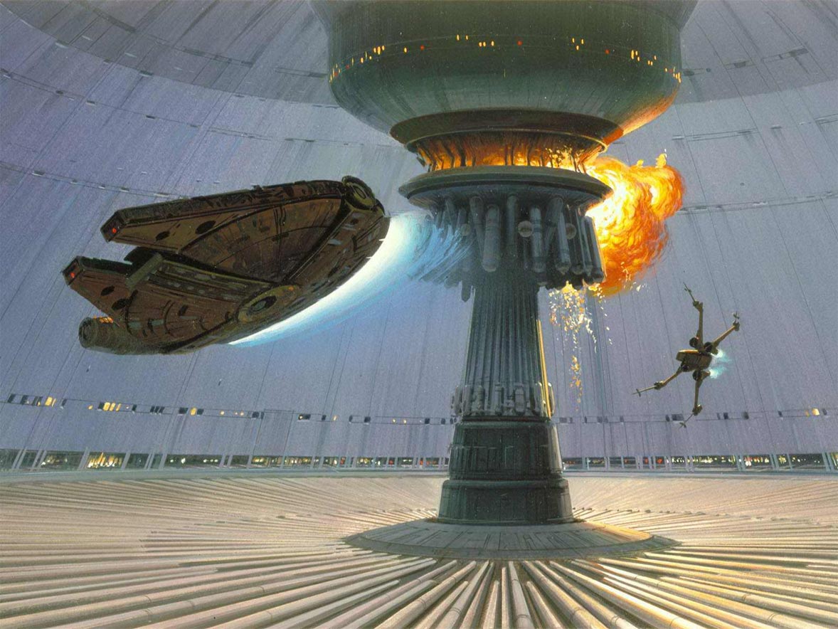
http://www.igorstshirts.com/blog/conceptships/2012/Ralph_McQuarrie/ralph_mcquarrie_06.jpg (2012). (Accessed 16th March 2016)
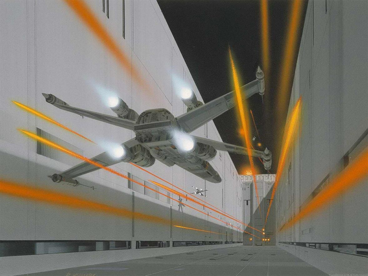
http://www.igorstshirts.com/blog/conceptships/2012/Ralph_McQuarrie/ralph_mcquarrie_17.jpg (2012). (Accessed 16th March 2016)
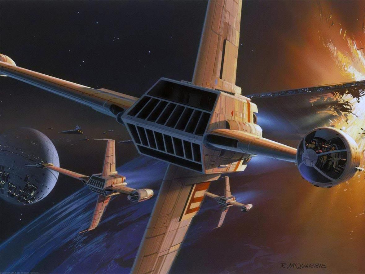
http://www.igorstshirts.com/blog/conceptships/2012/Ralph_McQuarrie/ralph_mcquarrie_26.jpg (2012). (Accessed 16th March 2016)
http://www.sideshowtoy.com/wp-content/uploads/2015/12/mcquarrie.jpg (2015). (Accessed 16th March 2016)
https://s-media-cache-ak0.pinimg.com/736x/fc/a7/7a/fca77a36f28ae763ec9040640daa9465.jpg (n.d.). (Accessed 16th March 2016)
https://www.artstation.com/artist/millenia (2015). (Accessed 18th March 2016)
https://www.artstation.com/artwork/P6aQy (2015). (Accessed 18th March 2016)
http://www.scifiscoop.com/wp-content/uploads/2009/05/star_trek_concept_art_by_james_clyne-5.jpg (2009). (Accessed 18th March 2016)
https://upload.wikimedia.org/wikipedia/commons/c/c2/Transiting_Exoplanet_Survey_Satellite_artist_concept_(transparent_background).png (n.d.). (Accessed 22nd March 2016)
http://blogs-images.forbes.com/trevornace/files/2015/11/jupiter-largest-planet-1200x900.jpg (2015). (Accessed 22nd March 2016)
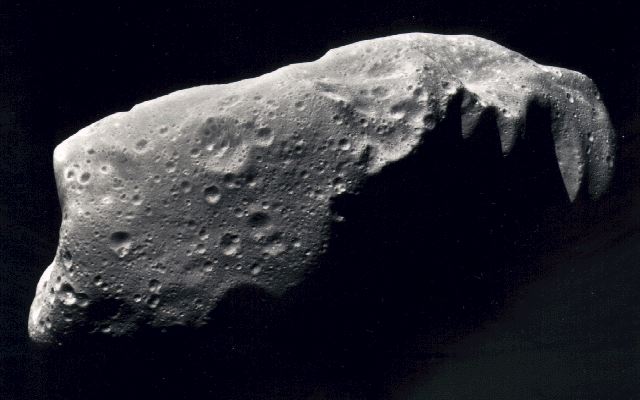
http://nssdc.gsfc.nasa.gov/image/planetary/asteroid/ida.jpg (n.d.). (Accessed 22nd March 2016)
http://blenderartists.org/forum/attachment.php?s=766f7807171046a02b2d4451c95ee224&attachmentid=256404&d=1377815546 (n.d.). (Accessed 25th March 2016)
http://rpggamer.org/uploaded_images/bg_galactica_over_earth02.jpg (n.d.). (Accessed 5th April 2016)


.png)