 |
| An Alternate Colour Scheme for my Final Piece |
 |
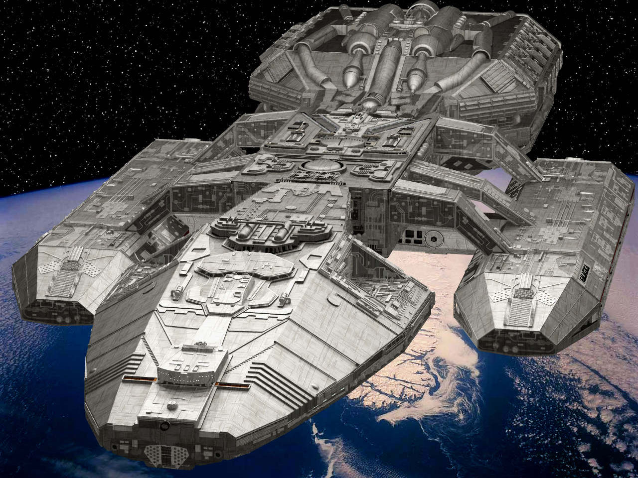
| My Final Piece |
 |
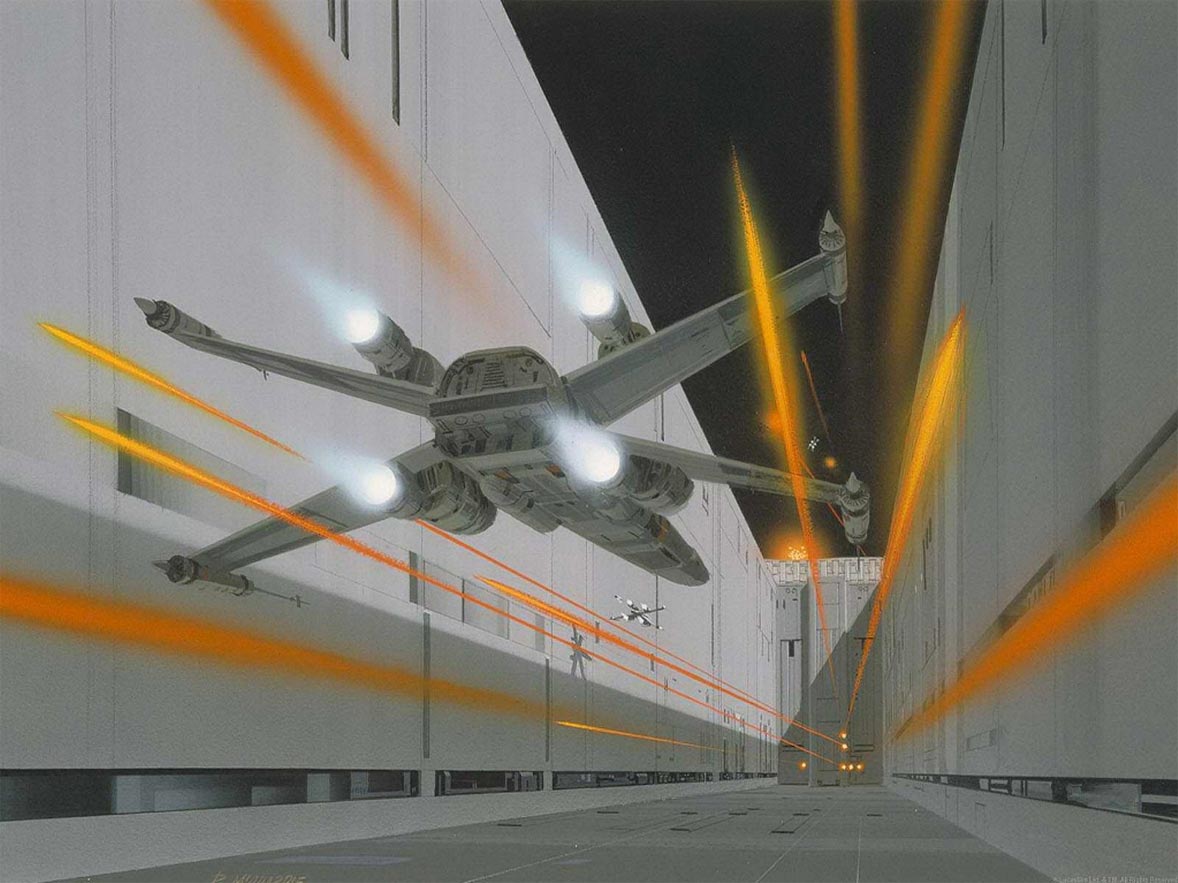
| Demonstrating the use of the Rule of Thirds |
 |
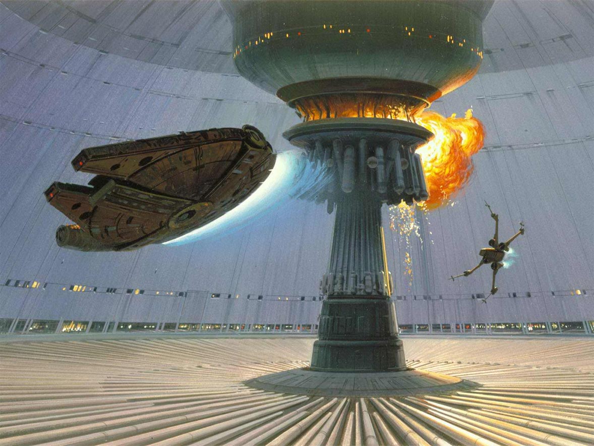
| Demonstrating the use of the Golden Ratio |
 |
| A Colour Palette |
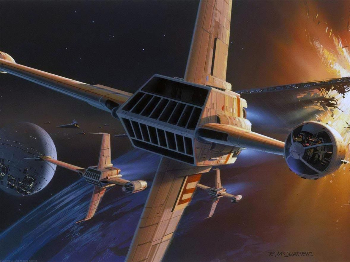
This is the completed version of my final piece. Once again, I struggled to decide on an ideal lighting for the scene, and even now I still consider both to be near equal. However, in the end I leaned towards the blue tinted skies, finding the black skies gave a bit too much of a contrast with the stars, and feeling the white glow at the top right felt a bit too intense and distracting.
I have added a planet to the bottom left of the screen. This was initially going to be a similar form as what I interpreted as the primary form in the piece I used for my artist research on Wassily Kandinsky, although after beginning to colour it I realised there was no real way for me to link the two. Nonetheless, I feel the planet adds to the scene nicely, as well as providing a vague sense of scale for the ship, and giving me a means of adding a glow effect.
Some lighting on the ship has been changed. Differences are subtle, but I tried to make the sides of the ship darker to indicate the sun was in front of the ship, outside of the scene, and that no light is being cast onto the sides.
I also smudged some of the stars to make them seem as though they were twinkling. I felt the sky was too plain with all the near identical stars, only differing in sizes, so I made some of them look more unique and eye-grabbing so as to prevent repetition and give the piece a sense of energy.
As you can see by the third and fourth images, I tried to abide by the Rule of Thirds and Golden Ratio. I feel that, when combined with the bright, alien colours that stand out against the dimly lit landscape, these techniques proved extremely effective at drawing attention immediately to the ship.
Overall, I am satisfied with the outcome of my project, and feel it was a huge success. Sadly I was unable to pursue my initial goal of making a bullet hell themed project, but I feel just as satisfied having completed the task I settled for.


.png)